
Illustrating Narnia: what I learned working on an imaginary brief
- wrightcarys

- Sep 13, 2022
- 8 min read
This blog will be a bit of a departure from my previous posts, most of which are about my sketchbook practice and observational drawing. Today, I will be talking about making work from my imagination.
What is imaginary drawing?
The opposite of observational drawing, imaginary drawing is drawing something without looking at a real-world reference. This may sound like a simple distinction, but I'm going to talk in a bit about why in fact these two do overlap and combine at times - bear with me.
Imaginary drawing is something that me, and I think a lot of illustrators, can be a bit nervous of. Do you know the feeling of drawing something fro your imagination and no matter how hard you try it just doesn't look the way it does in your head? This is what Ira Glass calls 'The Gap' between your taste, which is good and made you want to create in the first place, and your skills, which do not yet match your taste. It can be really frustrating. It can even cause you to give up.
I think thatyour imaginary drawing gets better as your observational drawing does - and this is the link. For me, I know that the more I draw from life, the bigger my mental frame of reference. If I'd had to really look at something carefully and draw it, then I'll get a better mental understanding or muscle memory of that thing. Drawing more from life also gives you more confidence in your drawing abilities, and more time to play and experiment with different materials.
I decided at the start of this year that I wanted to make more imaginary drawings, or illustrations based not on what I could see but what I could imagine. This seemed daunting at first, so I thought about how to make this more appealing to myself. I decided if I gave myself a 'dream brief' this would help - so I did. I pretended someone had commissioned me to illustrate one of my favourite books from childhood, The Lion, the Witch and the Wardrobe.
Why Narnia?
Illustrating a Narnia book was an important for a few reasons, all relating to wanting to set myself a challenge.
I wanted to raise the stakes, and illustrating a book I love makes the pressure a bit more intense for me
I have previously struggled to create backgrounds, and this setting would force me to consider not just characters but setting and backgrounds
Being firmly a fantasy book, illustrating Narnia books means I have to be imaginative in my drawing. There are no real life fauns for example, alas!
There are lots of children of different ages, giving me a chance to practice this challenging element of drawing picturebooks for children
Getting started
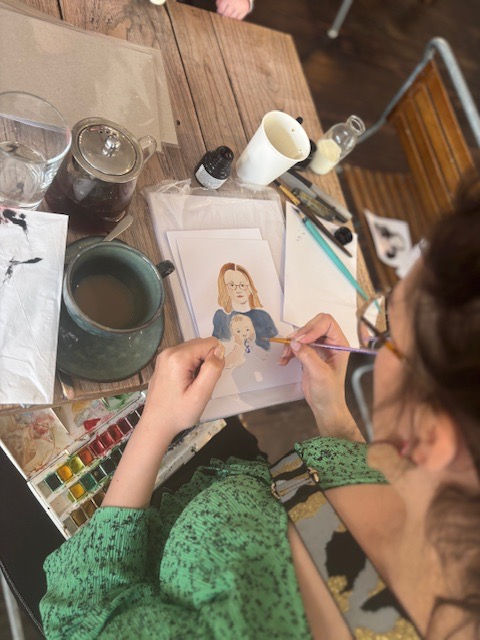
I started where I do most things - in my sketchbook. At first, with no idea why, I drew in pencil. Then I remembered I really don't like drawing in pencil very much, so I started drawing in dip pen. Ooh that was so much better!
I listened to the audiobook to re-connect with the story. I listened to the version I had as a child, read by Michael Hordern, which is the best version (not that I'm biased!). Here are some of my early initial drawings.


Drawing in this way helped me find my way into the book and which parts of it I might want to focus on for my illustrations.
Setting
I have a theatre background, so perhaps it's no surprise I approached this with a bit of theatre-maker's hat on. I thought about if I wanted to set the book in the more traditional 1940's the text suggests. If you don't know The Lion, the Witch and the Wardrobe, it is set against the backdrop of World War 2, and the children are sent away from Blitz-struck London as evacuees
I made some drawings, but I decided I was bored by the vintage setting. It didn't feel interesting enough to me somehow - and the joy of this being a made up commission is I could do what I liked and challenge convention! This project became more fun for me once I made the setting a modern one with a modern route into Narnia. I was working on this during the first few months of the Russian invasion of Ukraine, and a war-torn setting felt sadly apt.

Character
I knew early on that I wanted to create main characters in the Pevensie children that felt like modern children. They are from London, and 40% of today's London is from a 'Black, Asian or Minority Ethnic' background while 90% of London children go to a school which is majority 'minority ethnic'. This wasn't just a political or 'woke' decision, but one based in the children I see every day walking to my local school. That said I think we could do with more fantasy books with non-white children in them.
I grew up with copies of The Chronicles of Narnia with Pauline Bayes' beautiful original illustrations. In making my own take, I wanted to keep some of what I loved about her work, like it's warmth and magic, but refresh the characters and setting for a modern audience.

Similarly with charcters like Mr Tumnus, I thought about modern London. He is a tattooed, bookish hipster type while the White Witch is based on 1920's glamour meets gothic aesthetic. Some of Lewis' text has phrases that don't really fit with a modern audience at all - have you ever heard a child say 'crumbs' or 'by Jove'?! But this is the beauty of the imaginary brief - I could cast aside practical things like that and do what I wanted with the text. I had loads of fun thinking about these elements, and again felt a bit like I was designing costumes for a theatre show - something I hadn't done since university.
Process
The final artwork was only a small part of this project. What I'd wanted to learn about is a picturebook process, how I'd move from initial ideas, through roughs and into finals. I wanted to practice this because I still haven't had a book project and thought it'd be good to learn.
Generally, I am someone who's a bit 'seat of the pants' in my drawing practice. I like to skip any pencil and rubber planning and get straight into the exciting part of making bold marks with messy materials. This has served me well in my observational drawing, giving me the freedom to be expressive and the confidence to work intinctively.
However, I have learned from courses like Goodship Illustration's wonderful Picture Book Course that working with a publisher often requires lots of edits. While this was an imaginary brief I could do what I liked on, I wanted to practice some of the process techniques the course had taught me - things like thumbnails and roughs. Ella Beech, who's Project Gang I'm part of, also encouraged me to embrace planning not as boring but as useful.
Thumbnails
First, I had to think about which scenes from the book I wanted to illustrate. I'm lucky in that I had complete freedom here. I made an initial list of a very ambitious amount of drawings. I wanted to choose differnt parts of the book that had contrasting moods and levels of action, to give myself some nice range within the same project. I was also interested in how the seasons change throughout the book and wanted to incorporate that.
I then set about working on thumbnails for these, using inspiration from my first round of general exploration sketches.


You can see some very rough spread thumbnails in these pages along with some cover ideas.
Roughs
When I'd chosen thumbnails I felt worked well, I worked them up into roughs. I was a bit confused initially about the difference between thumbnails and roughs - what helped me was thinking about thumbnails being very small and roughs still being sketches but being more like actual size. Worth noting though some people like to so very small roughs, so it's really up to you!
I'm going to use the spread of Edmund and the Witch's first meeting to show you how I progressed through a few stages.

I drew the above sketch in pen really early on in the process, and I knew I wanted to keep this in the final artwork because I felt it worked well. I then needed to think about how it would work as a full spread. So I drew it up into a landscape layout.

I then drew it again on my ipad in Procreate. I am not a big whiz on Procreate, but I found this process was a bit of a revelation. I really loved:
Being able to easily move things around in layers
Being able to colour rough on top of my bloack and white roughs
Being able to flip the image if I needed to
Being able to re-size elements

Colour
I love colour and have spoken about it in my most recent blog. Normally, as with my drawing, I like to be very intuitive with my colour and don't really plan. Not sure what this is saying about me - but oh well! However, with this project I wanted to use a specific limited palette because I knew it would help me not over-think what I was making. I also knew that planning this palette was important in saving me time and making sure everything worked nicely together. Where I can afford to be instinctive for a single image, for a series of images I need to be a bit more considered.
I also veered away from some of the brighter palettes I'd been using in my observational work, and chose a more muted range of colours that reflected the Winter setting of most of the book.

I looked at art images that inspired me and picked out some of the colour choices. From there, I adapted the colours further into ones that felt like mine. I then used these over my roughs on Procreate.

Procreate took me right up to the point where I wanted to paint the final artwork. For this image, I had some very useful feedback from Katie Harnett at Orange Beak during a tutorial and I actually flipped the image I had so that the characters were on the left hand side and the reindeer were more in the background.

Final images
By this point, I'd worked on the images through so many stages I felt very confident about composition and colour. I had no more planning left, and could focus all my attention on execution. I put an audiobook on and got into that lovely flow state, painting in gouache.
I used gouache because I wanted to get better and more confident in painting, so this was another little stretch. I think I'd slightly written off painting because I don't really get on with watercolour (too slow!) but I hadn't tried gouache. Turns out I really like it! I also like that you can use other materials over it in a nice way, so I have also used some pencil and crayon in these images.

I ended up painting 3 spreads plus a cover. This was less than all the ideas I had at the start of the project, but felt like enough given all the stages.


Nice extras, and things I didn't finish
Ok confession time, I didn't finish my cover! I also intended to create some black and white illustrations and some chapter headers. But life happened and I didn't get round to it. But I am giving myself a bit of leeway because overall I did feel that I learned a lot from doing this.
I did make some endpapers, which are more of an extra, and had lots of fun thinking about the cover (if not actually making a final final version). This is where I got to, and here are my endpapers using turkish delight wrappers as inspiration, and the Wes Andersen film Grand Budapest Hotel.
I am fairly happy with my cover, but I painted the image too big on the background so I can't fit the letters in! I don't have a lightbox so all my finals were done by eye. Here, I messed up! I think I will try and learn more on Photoshop though and cut them out onto a different background and play with lettering


So there you have it! If you've made it this far thank you and I hope this has been helpful. This project was really great to learn more about the picturebook making process, and I hope it's been an interesting read.
I've more recently been using another of my favourite books, Northern Lights, as inspiration for some black and white illustrations. You can see them on the 'illustration' page of this website.
I'd definitely recommend setting your own brief if like me you're working as a freelance illustrator but haven't yet illustrated a whole book.


Comments